Apti Corporate Website (hiapti.com)

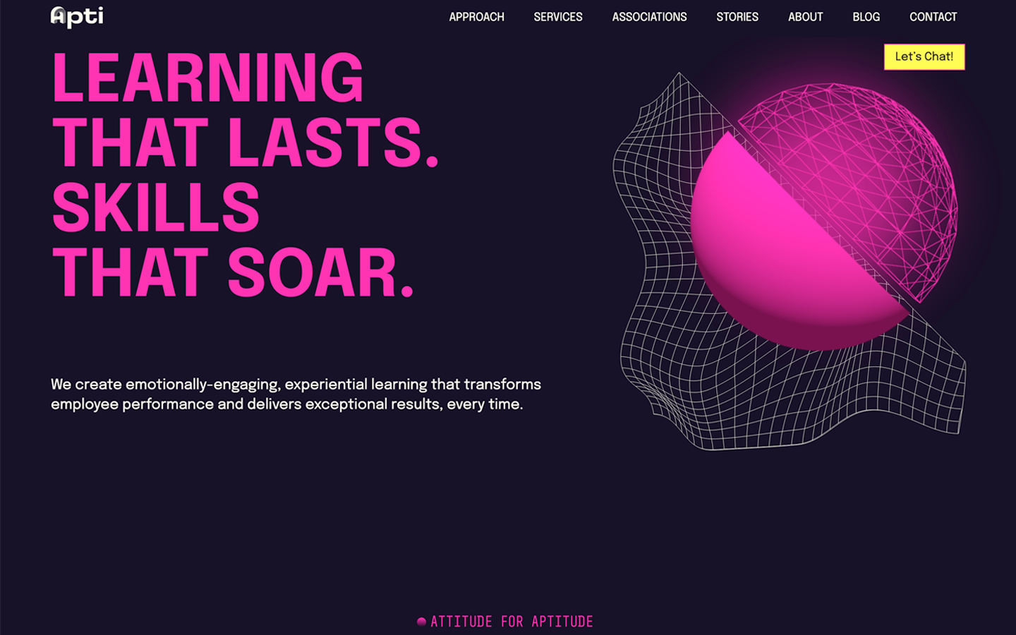
Apti builds emotionally engaging, experiential training, and its corporate site, hiapti.com, is a real looker. The catch? It launched as a hard-coded single-page app, so every little content change needed a developer. I rebuilt it as a fully custom WordPress theme and block library that marketing can run on their own. Every original interaction and animation made it through, and after a dedicated speed pass it scores a perfect 100 in all four Google PageSpeed categories, on desktop and mobile.

The challenge

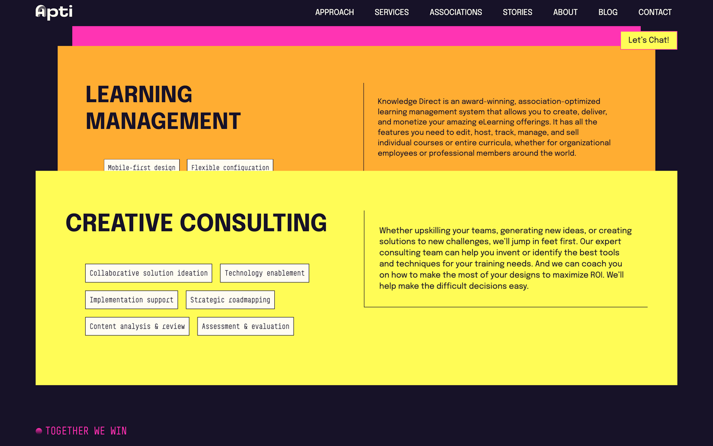
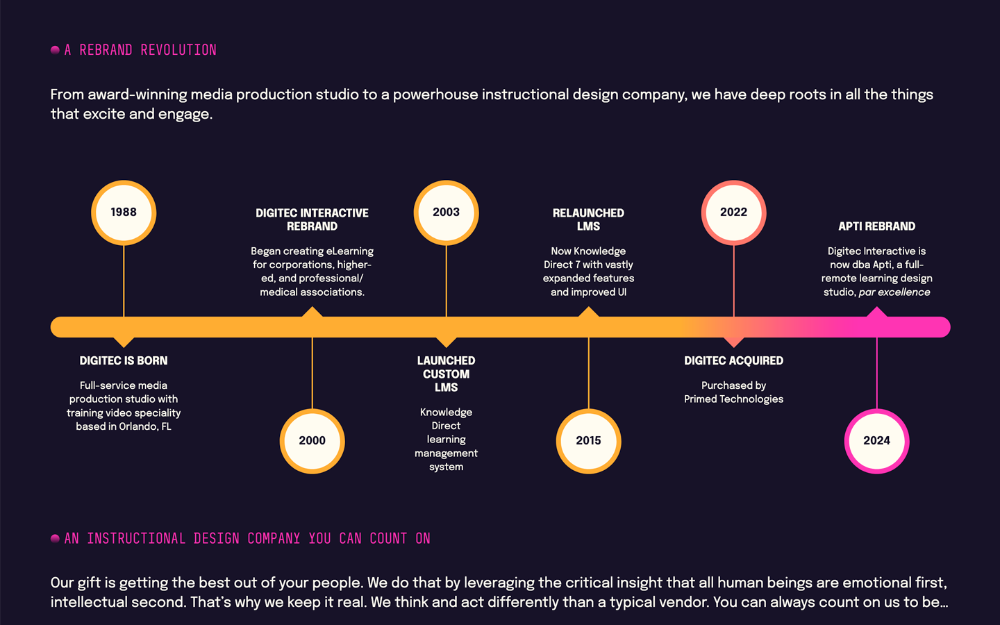
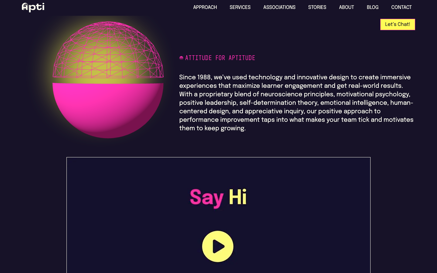
The site tells its story as you scroll. There’s a full-width hero, a 3D sphere that follows you down the page before locking into place, content cards that shrink and stack as you pass them, and an animated brand timeline. Visitors loved it. Nobody could edit it.

The goal: give the marketing team a real CMS, keep every bit of that motion, and not pay for it in page speed.

What I built

A block library that doubles as a design system

I rebuilt the site as a custom WordPress theme with 16 Gutenberg blocks and a few editor extensions. Every section of the original design became a reusable, guard-railed block, so non-developers can build brand-new pages that still look unmistakably Apti.

  • WordPress
  • Gutenberg
  • JavaScript

Cards that stack themselves

Those shrinking, stacking cards are a tag team. The sticking is pure CSS (position: sticky), so each card pins in place without any JavaScript at all. The shrinking is JavaScript, scaling each card based on scroll position as the next one slides over it. Letting CSS handle the part it’s great at keeps the script small and the scrolling smooth.

  • CSS
  • JavaScript
  • Sass

Carousels that fit the space

Every carousel on the site runs on Slick, set up to fit whatever room it has. Carousels work out how many slides fit the current width, hide their arrows when everything already fits, and rebuild themselves when the window resizes. The awards and customer logos scroll as continuous marquees in opposite directions, and case-study sliders only switch on at 800px and below, where the content stops fitting side by side.

  • JavaScript
  • jQuery
  • Responsive Web Design

Only load what you need

Scripts and styles load per block and per page, only when they’re needed. The single biggest win was loading a hefty third-party SDK on demand instead of up front, which wiped about 2.7 seconds of main-thread blocking off the homepage. An automatic WebP pipeline with responsive sizes for each component keeps images nice and small too.

  • Performance Metrics
  • Image Optimization
  • Google PageSpeed

A security policy that actually ships

Marketing sites collect third-party scripts like fridge magnets. I hand-rolled a nonce-based Content-Security-Policy and HSTS header covering 15+ integrations, and sorted out a caching plugin that was sneaking in its own conflicting security headers.

  • Content Security Policy
  • Security Audits

Marketing tools as tidy plugins

The ABM and analytics tools (6sense, ZoomInfo, RB2B, LinkedIn Insight) each live in a small custom plugin that only switches on in production. There’s also a custom blog subscription built on Mailchimp’s Marketing and Transactional APIs, including a Composer-level patch to get their SDK working on PHP 8.

  • Marketing Tech/ABM
  • Mailchimp API
  • PHP

A workflow worth copying

Git-based deploys to WP Engine, a DDEV local setup with a custom “pull production” command, and a Grunt/Sass build. It worked well enough that it became the template for the company’s other marketing sites.

  • DDEV
  • Git
  • Grunt
  • Sass

A year later, keeping my eye on the ball (performance)

In August 2025, a new video highlight reel was added to the homepage to showcase the business and its plans to grow. Video is about the heaviest thing you can put on a page, and the site was already softer on phones than I liked: mobile performance on the live site was as low as 37, and best practices as low as 57.

First, the video itself. At 1080p it pulled 218MB once it started playing. A first round of compression got that down to 20MB, and further compression got the final cut to about 3.3MB. Even at under 2% of its original size, there’s no reason to load it until the user requests it: the page shows a static poster, and the video is lazy-loaded when someone actually hits play. Then I tightened up the rest of the design to make room for the extra weight. I did all of it on the dev site and measured as I went: over about four weeks and 200+ PageSpeed runs across nine pages, mobile performance climbed from as low as 33 to as high as 100, and accessibility finished at 100 on every page.

The single biggest win wasn’t the video at all. The homepage’s 3D sphere was a Spline scene, loaded through Spline’s own viewer, and that viewer was quietly sinking the page. On August 22, just removing it took mobile performance on the dev site from 46 to 99 in a single run. So I rebuilt the sphere from scratch in Three.js/WebGL: it looks the same, loads a fraction of the code, and calms down for anyone with prefers-reduced-motion turned on.

The old sphere shipped Spline’s entire 2.1MB viewer (plus the scene file), and that viewer was built to pull extra runtime and WebAssembly modules from unpkg.com on demand, some of them several megabytes on their own. The rebuild is a 1.5KB script on top of the standard Three.js library: one well-cached request of about 166KB compressed from jsDelivr.

The deploy got the same treatment: a baseline that morning, a run right after the deploy, another after switching on WP Engine’s Page Speed Boost, and a follow-up that afternoon to make sure it stuck. Mobile performance went from a morning low of 37 to as high as 100 that afternoon, with 100s for accessibility, best practices and SEO, and a clean sweep of 100s on desktop. Credit where it’s due: the Boost did the heavy lifting on mobile. Even with the new video on board, the homepage came out of it better and faster than it went in.

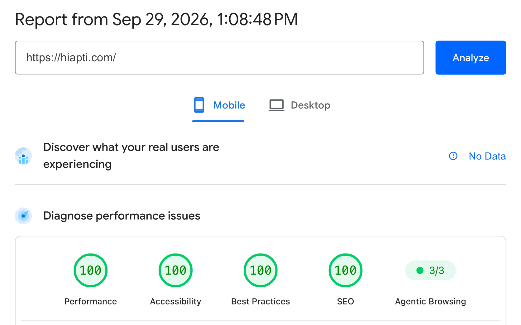
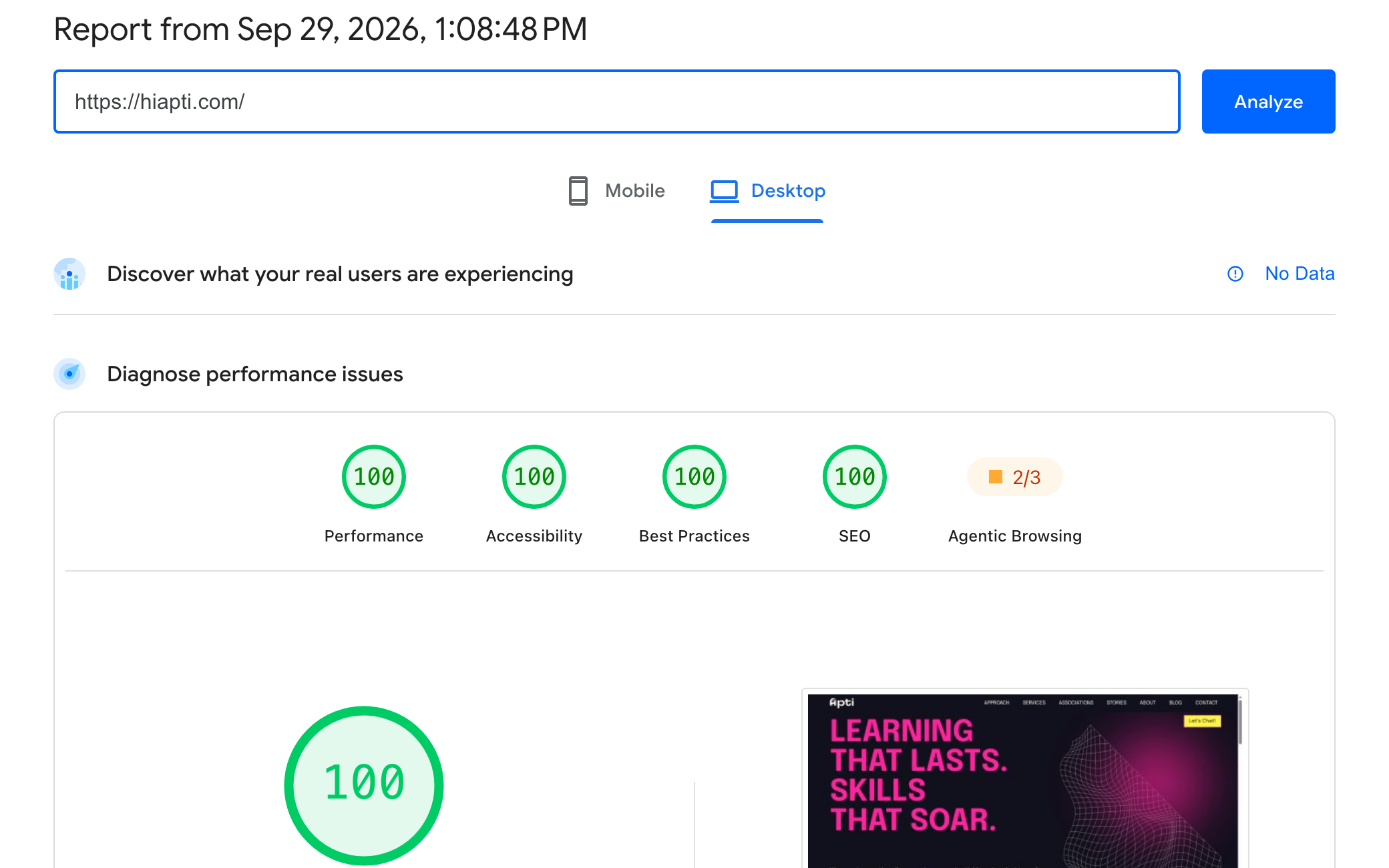
It’s held up since. A PageSpeed run on September 29, 2026 came back with a perfect 100 in all four categories on both mobile and desktop (screenshots below). Mobile performance still wobbles a few points between runs, which is just how Lighthouse works.
Google PageSpeed Insights report for https://hiapti.com/ from September 29, 2026, Mobile tab: 100 for Performance, Accessibility, Best Practices and SEO.
Mobile: 100 in every category
The same PageSpeed Insights report from September 29, 2026, Desktop tab: 100 for Performance, Accessibility, Best Practices and SEO.
Desktop: 100 in every category

Google PageSpeed Insights, a single run on September 29, 2026.

Stack & skills

  • WordPress
  • Gutenberg
  • PHP
  • Three.js
  • Sass
  • Grunt
  • WP Engine
  • DDEV
  • CSS
  • Slick
  • JavaScript
  • WebGL
  • Google PageSpeed
  • Performance Metrics
  • Accessibility
  • Content Security Policy
  • Image Optimization
  • Mailchimp API
  • Marketing Tech/ABM