Reduced motion, done right
Full prefers-reduced-motion support, plus a motion toggle right on the page for people who don’t know that setting exists. Either way you get an equally good static version, not a broken one.
- Accessibility
- JavaScript
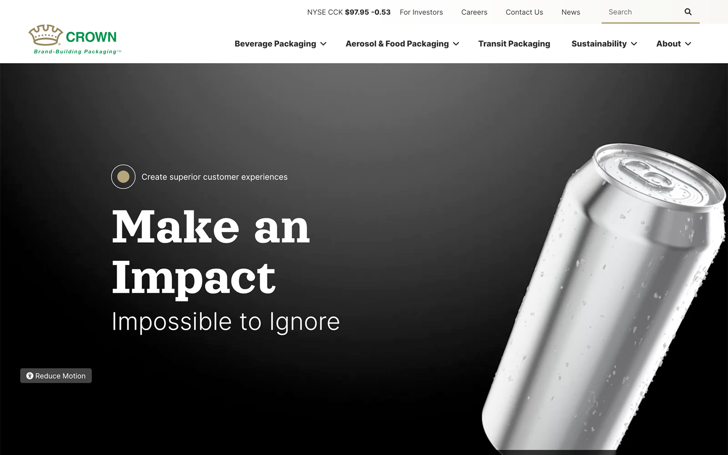
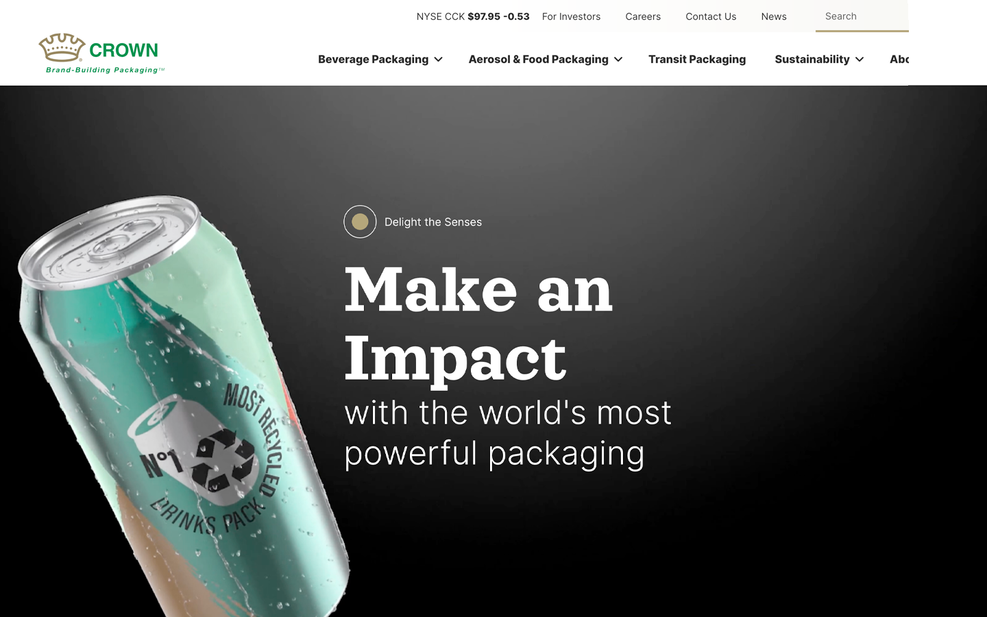
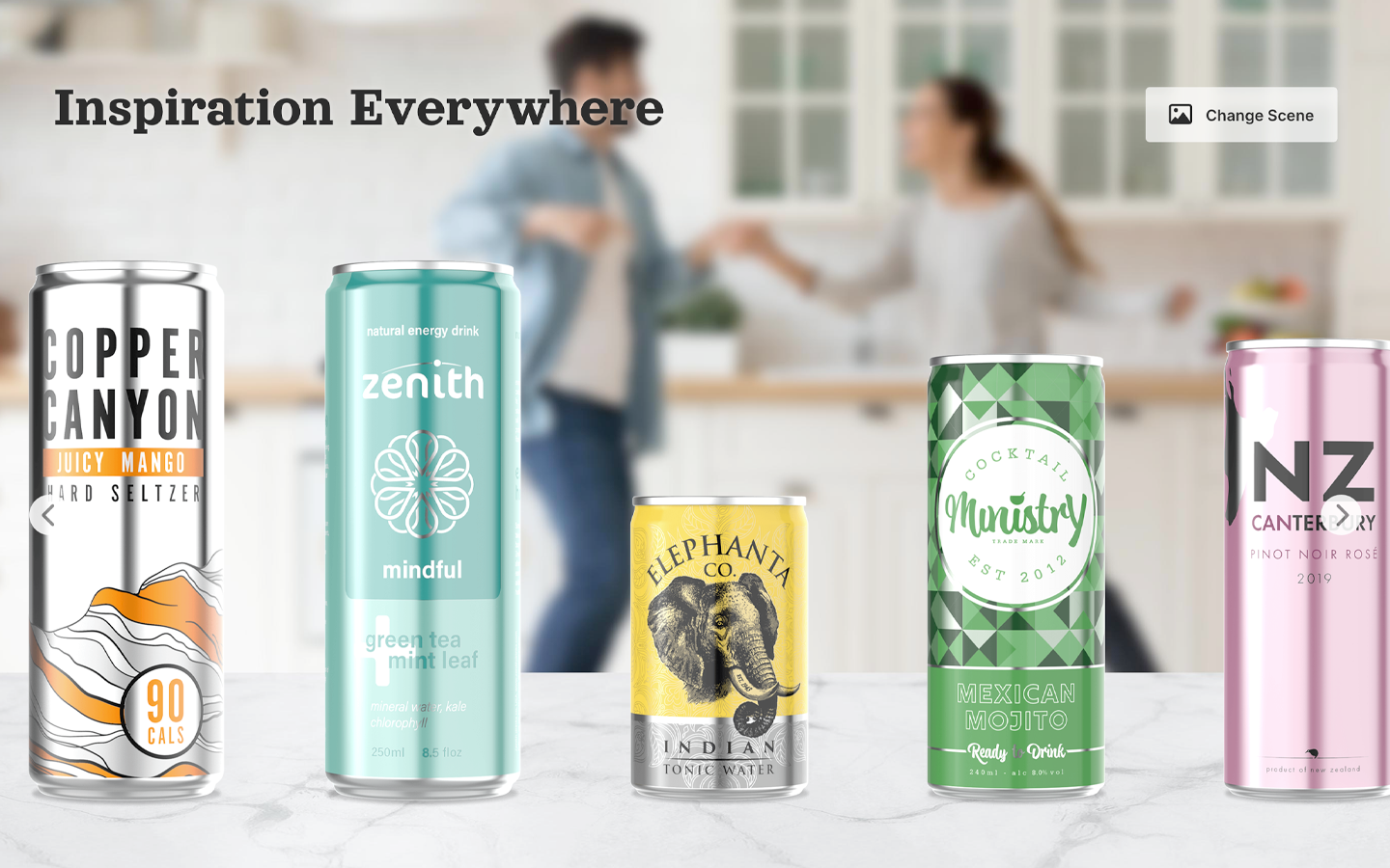
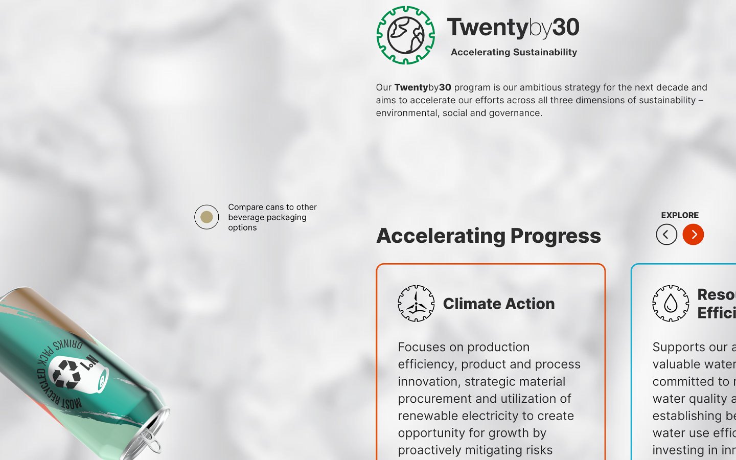
Crowncork.com is the corporate home of Crown Holdings, a Fortune 500 metal-packaging giant with plants around the world. Yes, they make the cans! The site covers their beverage, food, aerosol and transit packaging, plus sustainability (their “Twentyby30” ESG program), innovation, investors and careers. I led development of the new global site, which launched in October 2022 as part of a move from Drupal 7 to Drupal 8.
Site substantially updated by others since; description reflects launch state only.
The big idea in the design was animation. Nearly everything on the homepage moves as you scroll: a hero transition, a plain can that bursts into color as you pass it, a tumbling can that walks you through company highlights, and one long top-to-bottom scroll sequence.
The first version was classic scroll-tweening JavaScript, recalculating every animation on every pixel of scroll. It looked great but worked the browser hard. So during refinement I rebuilt it as CSS class-based animations. JavaScript still watches the scroll, but now it only cares about a handful of trigger points. Cross one, and it flips a class; CSS takes it from there and does the actual animating.
Add in accessibility as a requirement from day one (not a patch at the end), and the payoff was a perfect launch: 100 in performance, accessibility, best practices and SEO, on both mobile and desktop.
A perfect Lighthouse score only covers the pages you test. So two weeks after launch, I checked the whole site: 700+ URLs through Pa11y, with aXe as the test engine, against WCAG 2.1 AA. Then I turned the raw output into something people could act on, listing every issue type with its severity, the fix, the effort, the estimated hours and who owned it.
The results told a useful story. Only a handful were template problems: a table header with scope="column" instead of "col", a duplicated ID in the image block, and heading levels that skipped a step. Those were ours, and quick. Most of the rest lived in editor content (embedded videos without titles, empty links, lists that got mangled in the WYSIWYG editor) or on external sites the pages pulled in, where no template change could reach. Sorting out which was which let our developers and the client’s content team each take their own share.
Full prefers-reduced-motion support, plus a motion toggle right on the page for people who don’t know that setting exists. Either way you get an equally good static version, not a broken one.
Product showcase pages with five can designs each. Click one and it swoops forward, grows, and shows off more detail.
An interactive SVG diagram that follows a can from raw metal through recycling and back again.
A built-in news and press-release system that handles video and infographics.
One of the agency’s very first cookie-consent setups: an open-source consent library adapted for Drupal without breaking SEO or analytics.
Crown was the rare project where we got to build the blue-sky version. Cans burst into color, tumble through the company highlights and swoop forward when you pick them, which is exactly the kind of work that usually gets trimmed back the first time someone runs a performance test or a screen reader. We didn’t trim it. Moving the animation into CSS classes kept the browser relaxed. The major advantage of keeping an eye on accessibility and performance from the ground up was that every element was designed for its purpose, instead of being shaved down after the fact. The launch scores and the final product speak for themselves.