Years after I left Artistic Digital Services, they brought me back as a freelancer for one of their clients: a data broker that sells leads by state and by how old the data is. The leads lived in a database of more than half a million records, managed through an October CMS site I didn’t build. My job was to help the team visualize their data: an interactive county heat map, and a set of reports that had to agree with their own tools down to the last lead.
An internal tool for a client of Artistic Digital Services. The original is offline, but a reproduction of the heat map, running on randomized data, lives on CodePen.
3,142county shapes, each colored from live lead counts
500K+leads the reports had to account for, down to the last one
142 + 41,870 = 42,012the kind of check that proved nothing was lost or double-counted
Every county in the country
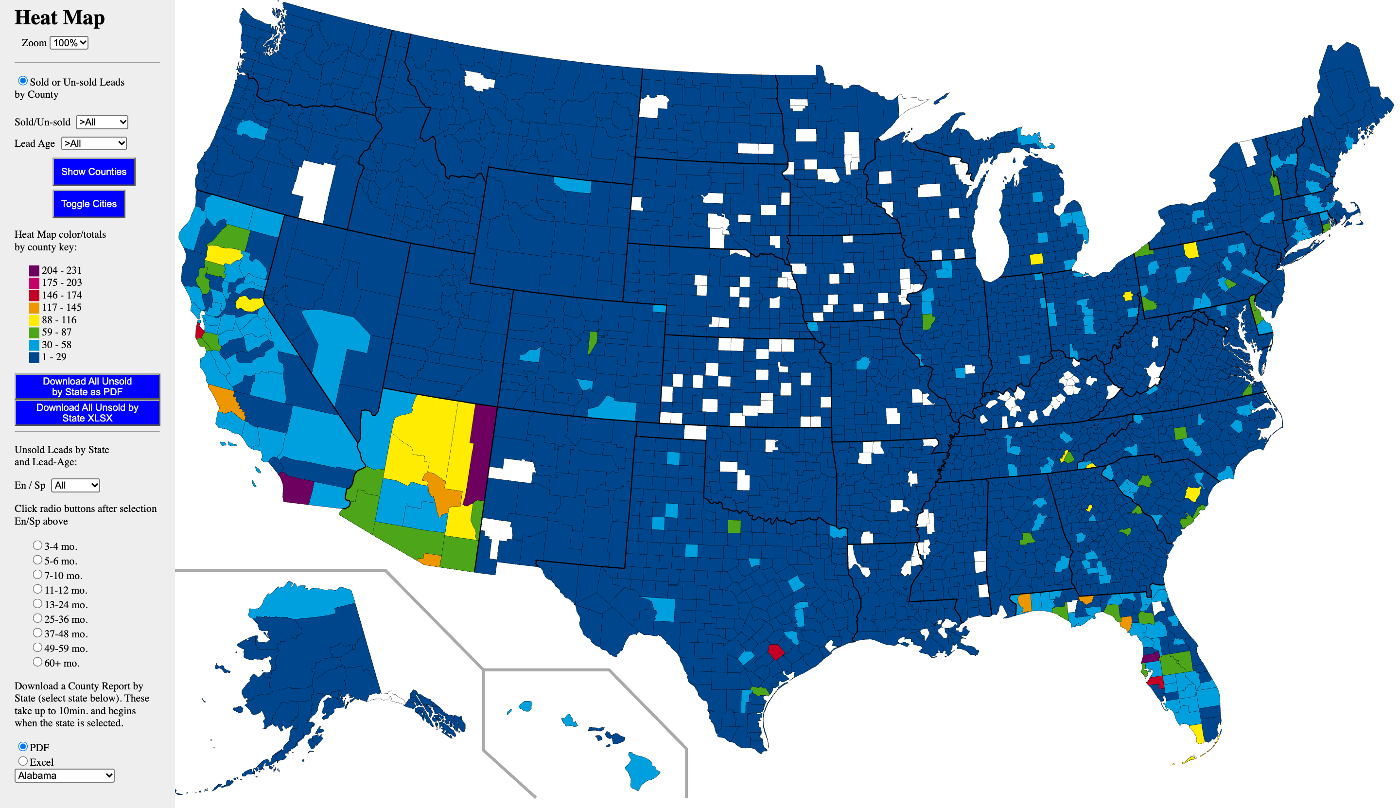
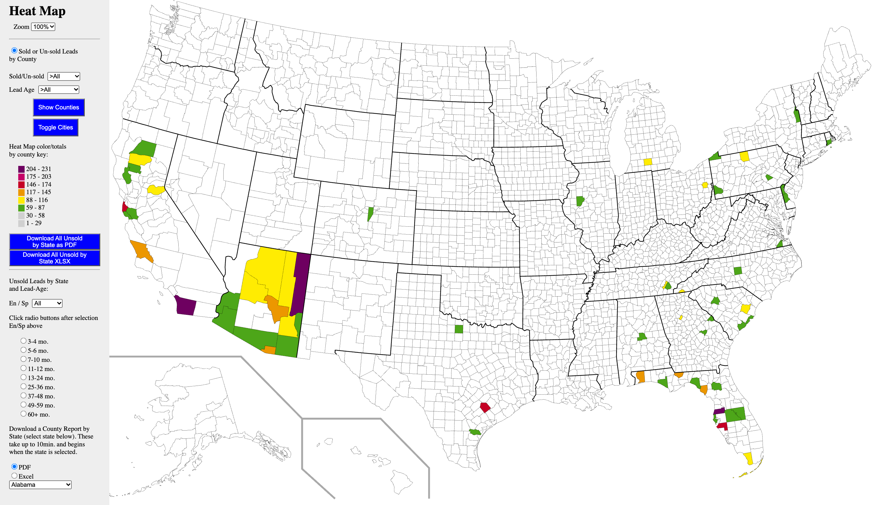
The sales team needed to see where their leads were. I started from a public-domain U.S. Census map with a shape for every county (all 3,142 of them) and colored each one by how many leads it held. Filters switch between sold and unsold leads and between lead ages, and an eight-step legend shows exactly which range each color covers.
My favorite part is how each count finds its county. Every shape in the map already carries a <title> element, like “Cook, IL,” which browsers show as a tooltip when you hover. So that text became the lookup key, with no table of county codes to maintain. Once a county’s count is found, it gets added to that same title, so hovering over Cook County shows its lead count with no tooltip library at all.
Illinois, drawn from the same public-domain map, with made-up numbers and the original map’s eight colors. The gold border is the county highlight.
Built for the sales floor
Keep your place
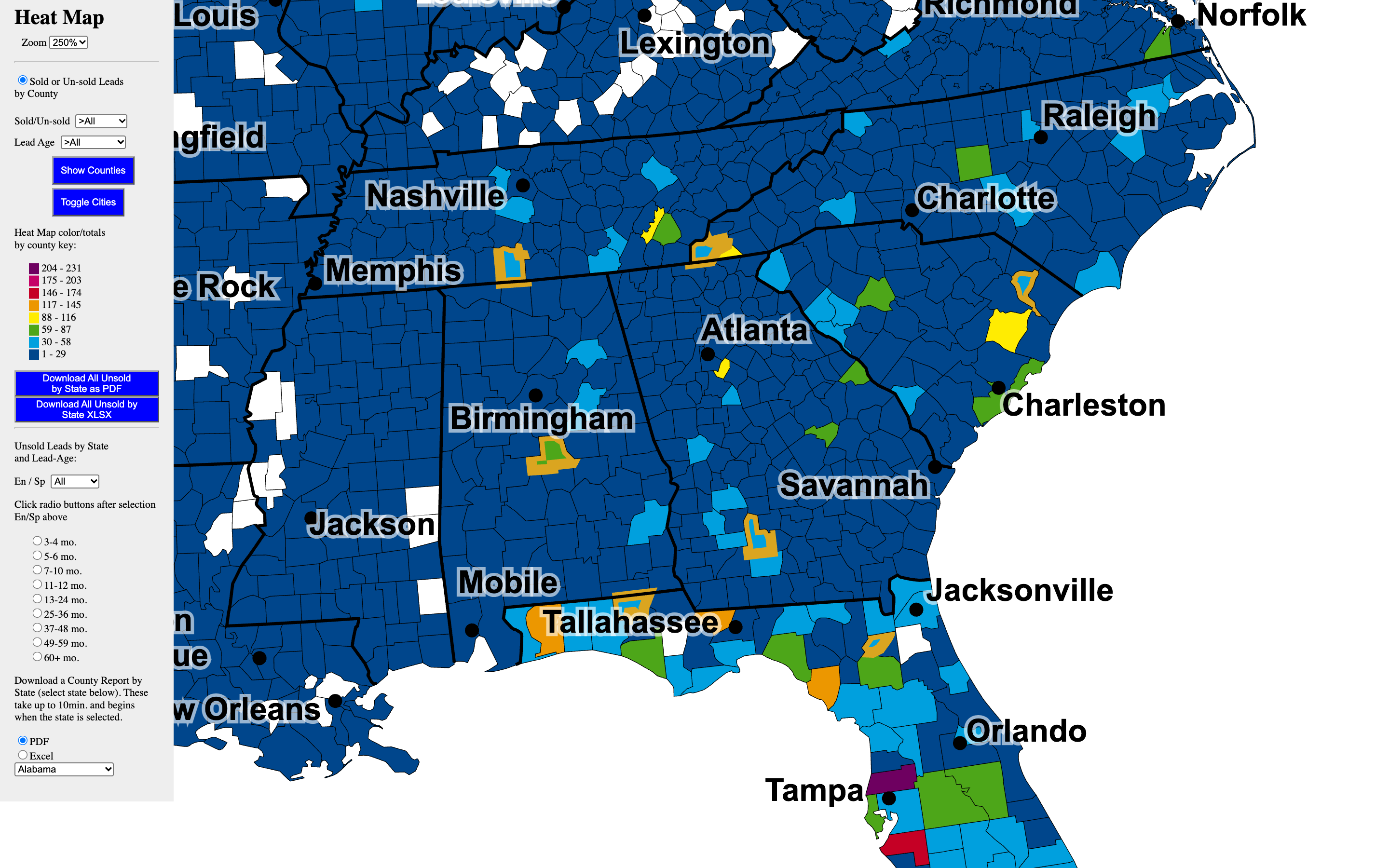
In early versions, salespeople could scour the map to find their particular counties, but as soon as other filters were changed and the map was recalculated, they could easily lose their place. Now a click puts a gold border on any county, and it stays put through every filter change. Highlight as many as you like.
JavaScript
SVG
UI/UX
Cities on demand
The team wanted cities on the map (“just locations,” the top few per state) because it made selling faster. I layered a map of cities over the counties, with a toggle to hide them, since the map was already plenty busy.
SVG
JavaScript
A legend that filters
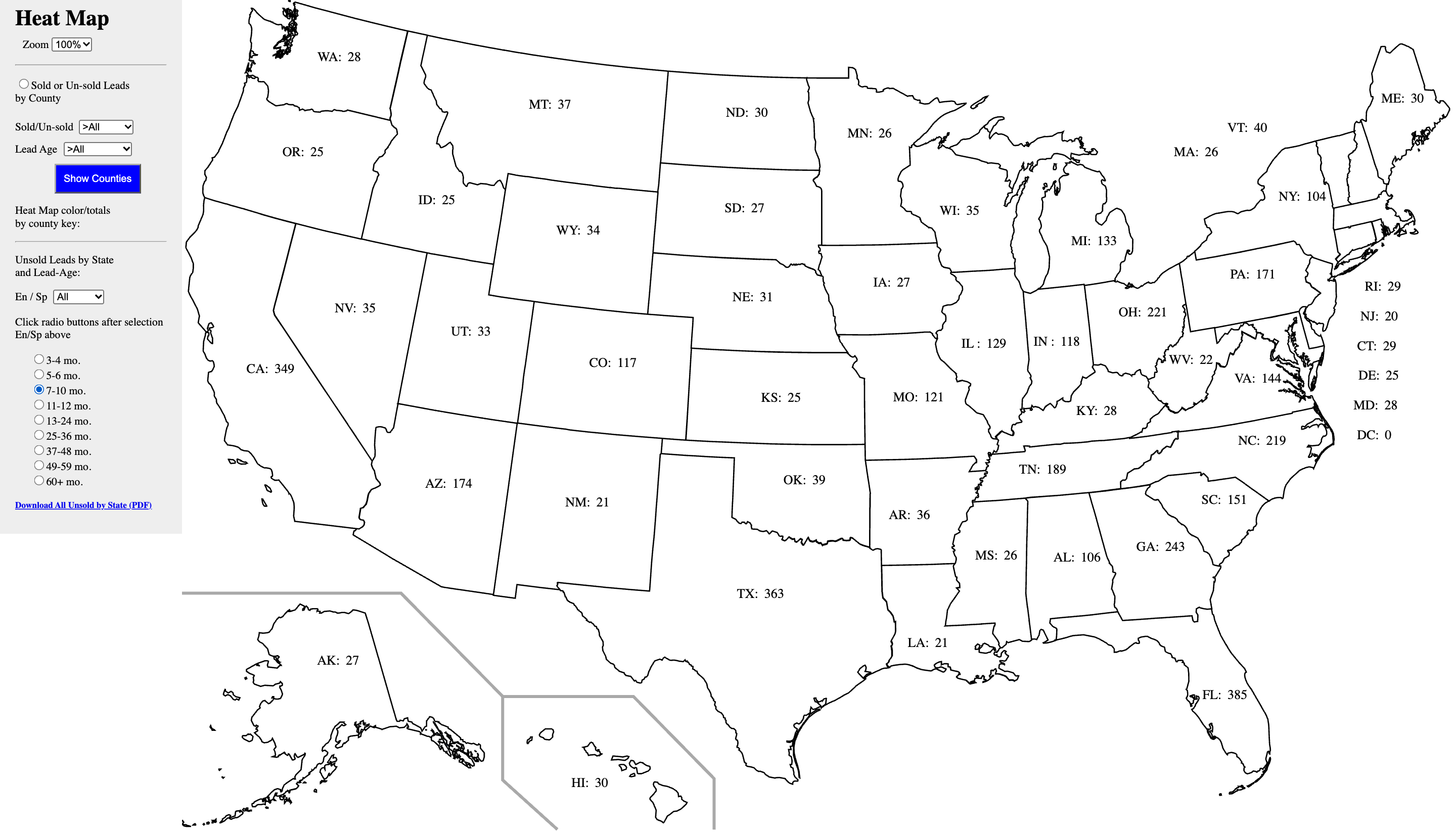
Click any color in the legend to hide that band of counties, which makes it easy to pick out only the busiest ones. Another set of controls puts each state’s unsold totals for a chosen lead age right on the map, one label per state. And zooming keeps you looking at the same spot.
JavaScript
SVG
On screen
The original is offline and I never had a copy of its database, so these come from a local rebuild of the site filled with generated leads. The map and its code are the originals. The numbers are made up.
Zoomed in, with cities on and seven counties highlighted in gold.The two lowest legend colors switched off, leaving only the busiest counties.Unsold leads per state for one lead age.
A cleanup tool nobody asked for
Matching counts to counties by name turned up a problem right away: the matching kept throwing errors for counties it couldn’t find. The data I’d been handed was messy. Some county names were misspelled, and some leads had a state that wasn’t a state at all.
That mattered for more than the map. Leads were bundled by state and county, so a lead filed under a misspelled county could be lost completely. A person reading it can tell what was meant. Programmatic string matching just leaves it behind.
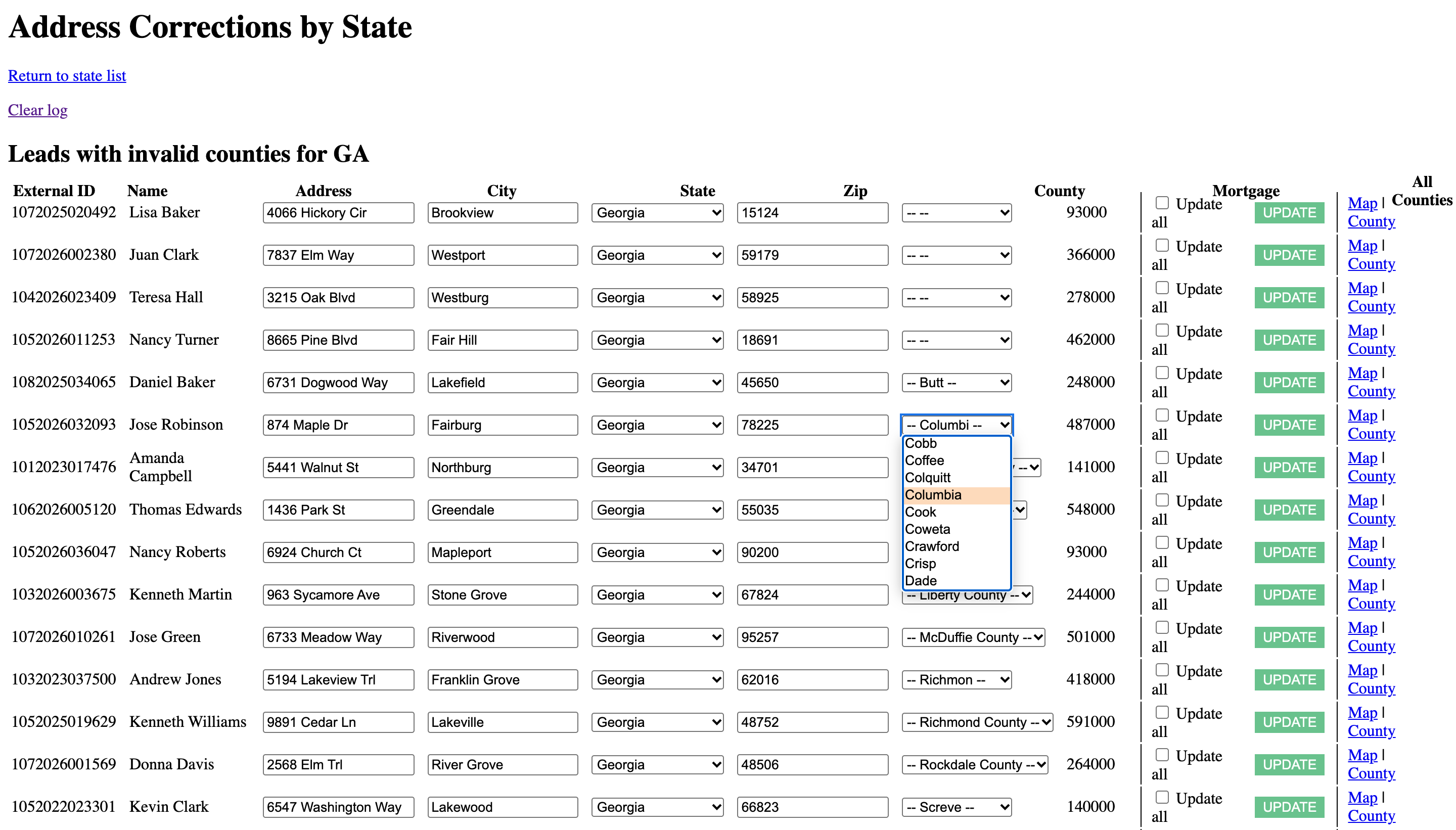
So I built a correction screen to make my own cleanup easier, first for states and then for counties. Pick a state and it lists only the leads whose county isn’t a real county there, each with a dropdown of the ones that are. One checkbox applies a fix to every lead with the same misspelling.
It wasn’t a requested feature. Once it worked, I included it as an enhancement and offered it back to the client.
Georgia’s bad counties, on the rebuild. “Columbi” is one click from “Columbia.” The names and addresses are all randomized example data.
Predicting next month from an ID
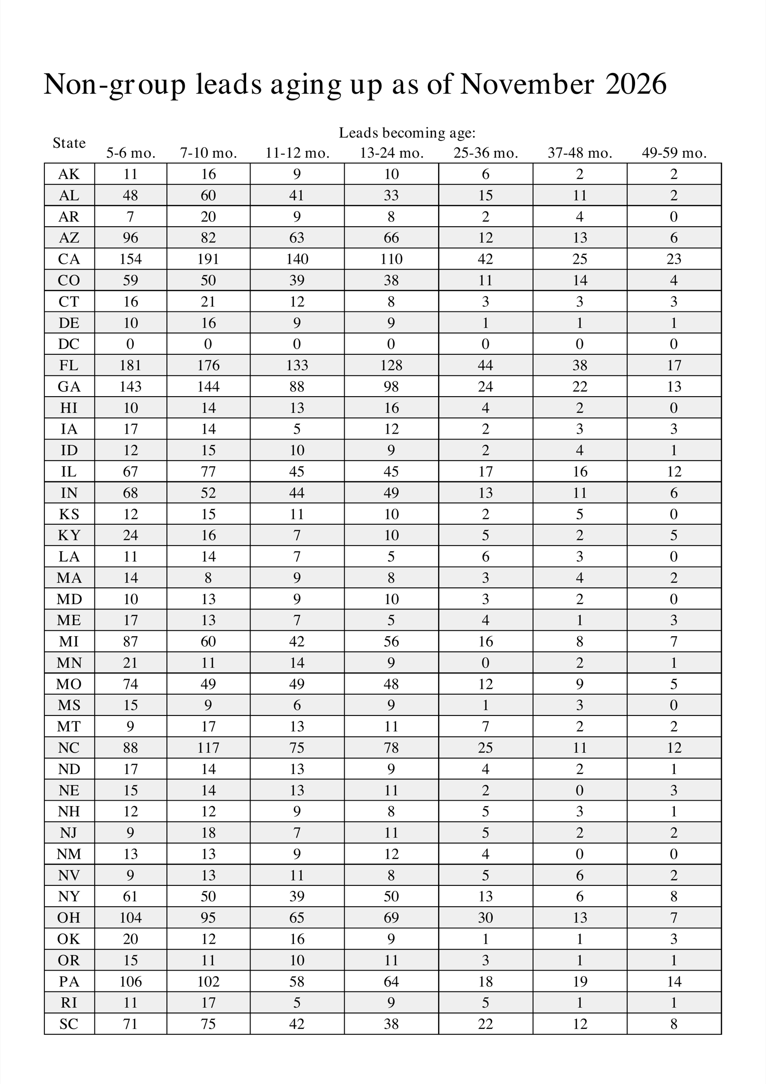
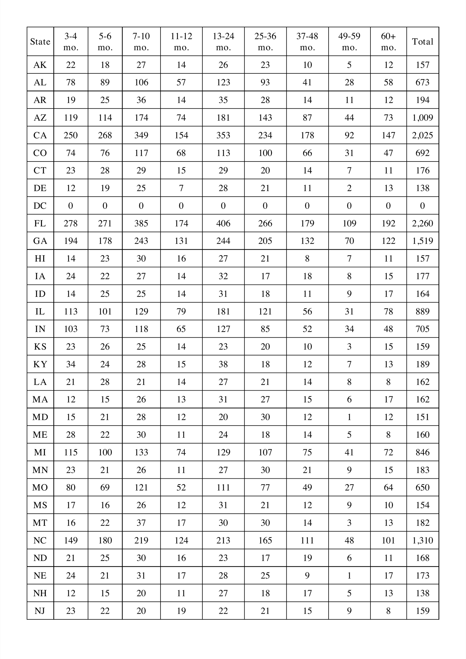
Leads are sold by age, in brackets from 3–4 months up to 60+, and every month thousands of them age into the next one. The client wanted a report each month: how many leads, per state, will move into each bracket next month, separately for regular leads and for each of two lead groups.
The answer was already in the data. Every lead’s ID has the month and year it came in built right into it. So “leads that will turn 5 months old in August 2023” is just every ID with 032023 in that spot. No date math on half a million rows, just one pattern per bracket, counted by state and laid out as a PDF.
The best moment in that ticket was a question, not code. The request said “normal, non-group leads,” and I asked whether that meant anything outside one group (which would quietly include the other) or leads with no group at all. It meant no group at all. One question, and a set of reports that would have been subtly wrong wasn’t.
PHP
// Which leads age into the next bracket next month?
// Run in July 2023, "5 months old in August" means created in March 2023.
$nMonths = $min - 1;
$date = date('mY', strtotime("- $nMonths months")); // "032023"
$pattern = "_" . $date . "%";                        // ID has MMYYYY after 1 char

$q = "SELECT count(*) AS leads, state FROM leads
      WHERE external_id LIKE '$pattern'
      GROUP BY state ORDER BY state";
The heart of the aging report, lightly tidied. The table name is simplified here.
Making two numbers agree
The client already had a tool for slicing their data, which they called the Sorter. The custom report builder I added over the winter of 2023 had to match it: any field, any operator (equals, IN, hide, IS NULL and more), as many fields as you like, for state or county reports. That sounds simple until the two tools disagree by three leads and someone has to find out why.
Over a 161-comment ticket, the culprits turned up one at a time. Yes/no fields stored as a mix of "0", "1", "true" and "false". A filter that quietly skipped every record whose memo was NULL. Agent IDs stored as comma-separated lists, so one lead could belong to several agents. A sold-date field that could hold more than one date. Each one got explained, tested case by case, and built into the report.
Not every fix was elegant. At one point I wrote in the ticket that a data cleanup was “essentially gaming the system to make the numbers match up.” It was still the right call, and so was saying it plainly.
Proof that adds up
The real test was simple arithmetic. In one state, 142 leads belong to one agent and 41,870 don’t, and together they make exactly 42,012, the total with no agent filter at all. The same kind of check turned up something useful in another: two agents had 12,480 and 105 sold leads, but only 12,561 between them. The difference means 24 leads had been sold to both.
The checks the custom report had to pass, with the client’s agents and totals swapped for stand-ins. When “with,” “without” and “all” agree, you can trust every number in between.
Reports, on paper and in spreadsheets
State and county reports
Sold, unsold or both; regular leads or either lead group; one state or all of them. Reports come out as PDFs (rendered with dompdf), and the county and state totals as Excel files too (SimpleXLSXGen), right from the map’s sidebar or a reports page.
PHP
MySQL
One source of truth for credentials
Several reports had their own hard-coded database logins, so a report copied from the development copy to the live site kept quietly reading development data. Pointing the reports at the site’s .env file fixed the mystery and the security smell together.
PHP
Security Audits
On paper
Two of the PDFs, generated by the same rebuild from the same made-up leads.
The monthly aging report: how many leads per state move into each age bracket.Unsold leads by state and lead age.
Looking back
This one was built over SFTP against a live development copy of the site, so my git history is a single snapshot, and most of the story lives in the client’s ticket threads. Honestly, those threads are the real portfolio piece: patient back-and-forth, test cases walked through number by number, and a plain question whenever a requirement could be read two ways. The map is the flashy part. The part I’m most proud of is that when the report said 42,012, everyone believed it.