Knowledge Direct: The Learner Theme, Rebuilt
- Role: Full-Stack Developer / Platform Engineer
- At: Apti (Digitec)
- Date: Sep 2026
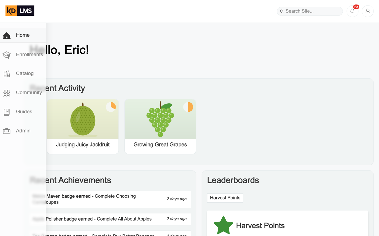
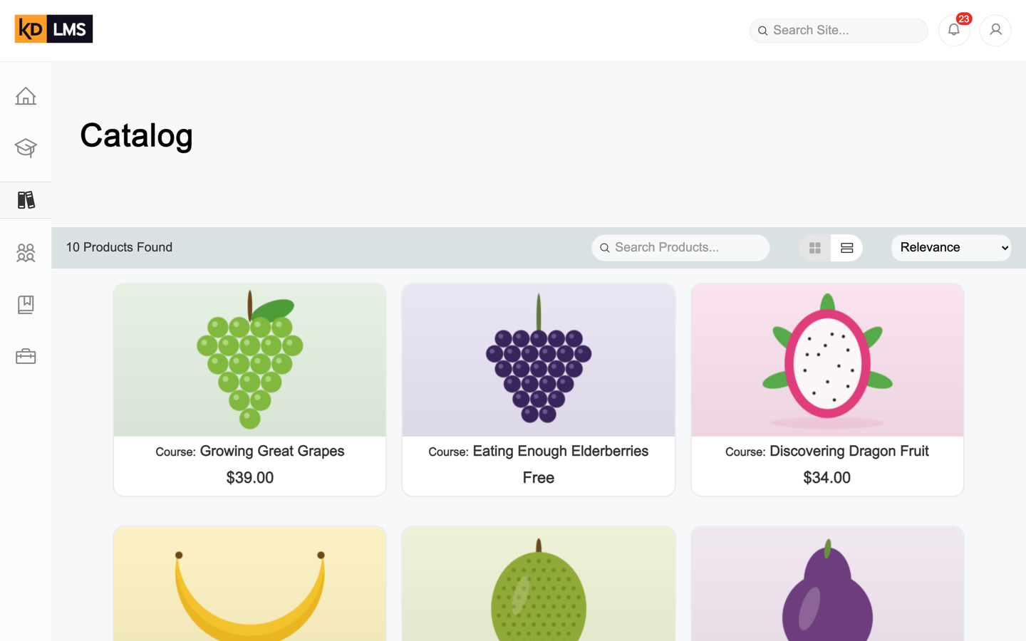
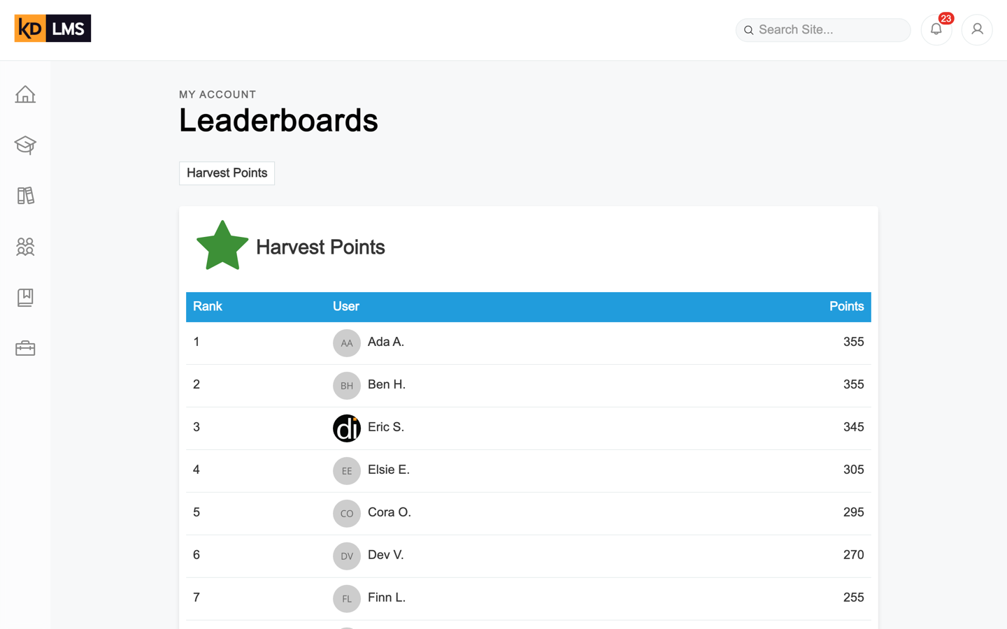
Learners spend all their time in Knowledge Direct’s learner theme: the dashboard, the catalog, the course player, their transcripts and achievements. It’s an AngularJS app that ships as its own versioned package, and it looked every bit its age. Over five and a half months I rebuilt it screen by screen, with a new navigation, layout, type and icons, without touching the API behind it or upgrading the framework underneath.
Built and kept current with production, but never released: KD7 is being retired first. The screenshots come from a dev copy filled with made-up learners and courses.
- 140 commits over five and a half months, all mine
- ~700 files touched across the theme’s source
- −637 net lines of SCSS, for a whole new look
- 0 framework upgrades: still AngularJS 1.7 and Webpack 3
Same app, new clothes
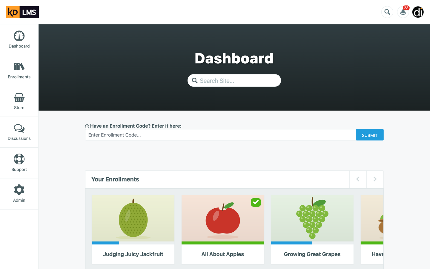
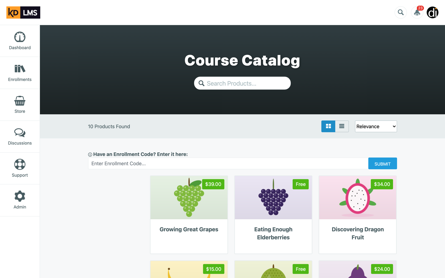
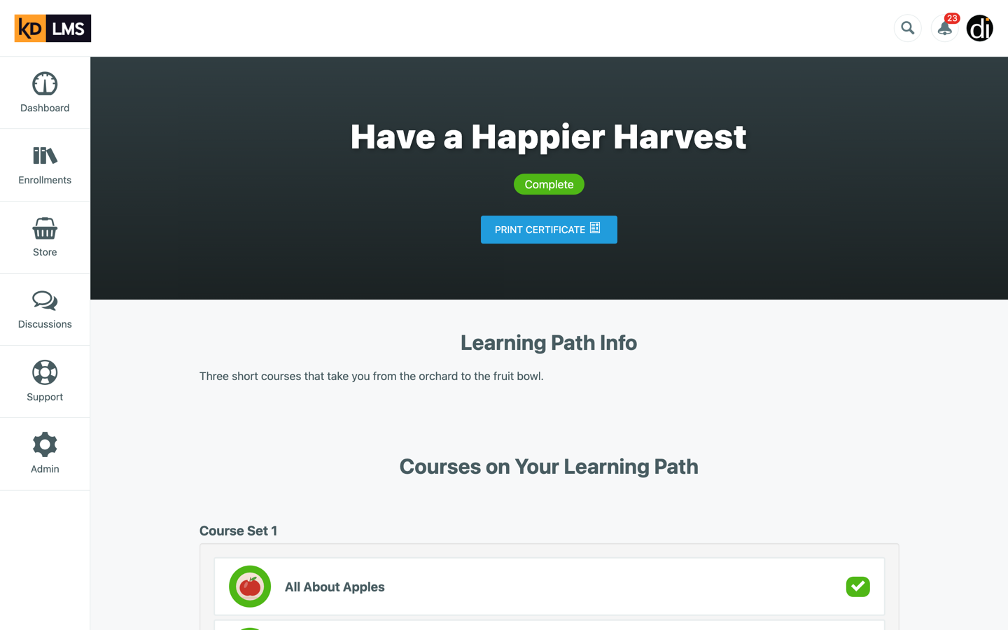
The old theme worked, but it showed its years: a big dark banner on every page, a chunky labeled sidebar, cramped cards, and styles that had grown one fix at a time. Colors, sizes and shadows were defined over and over, slightly differently each time.
The rule I set for myself was that only the theme changes. Same API, same data, same AngularJS 1.7 and Webpack 3 build, so every client could switch over without anything changing behind the scenes. That meant the redesign had to come from structure and styles, not from a shiny new framework.
Before and after
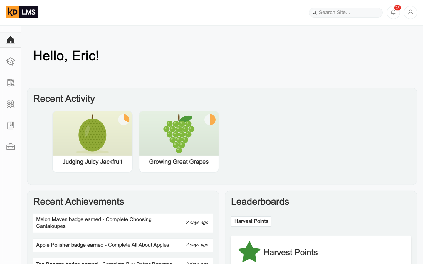
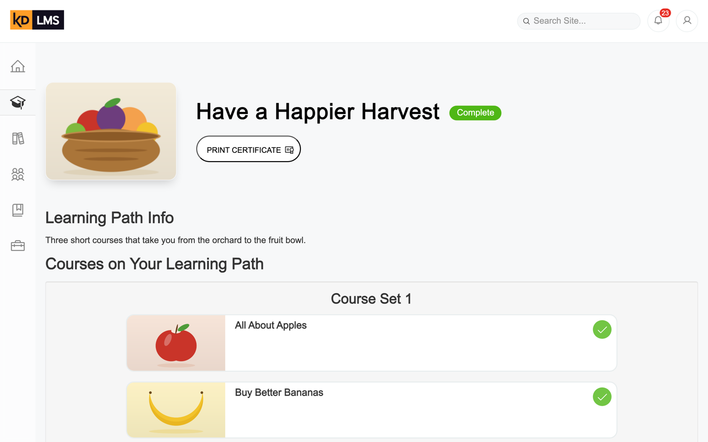
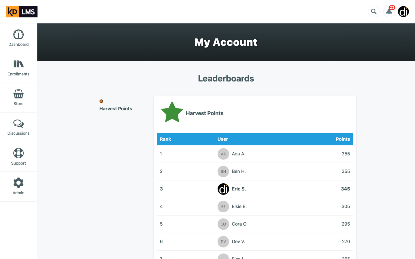
Same tenant, same data, same moment. Use the toggle to swap the redesign in over the original.
Dashboard
Catalog
Learning path
Leaderboard
Under the hood
Most of the work doesn’t show in a screenshot:
- Reorganized the app around pages instead of one big pile of components, so each screen’s templates, styles and logic live together.
- One set of colors, sizes, shadows and buttons, used everywhere. The SCSS ended up smaller than it started, even with a whole new design on top.
- A new type face (Epilogue, with an Arial fallback) and Phosphor icons, each icon with proper ARIA attributes or text alternatives.
- A slim icon sidebar that expands its labels on hover or keyboard focus, and a header with search, notifications and a user menu.
- Empty states for every list, so a new learner sees a friendly message instead of a blank panel.
- Audited the translation files for every missing key, so clients running other languages don’t get raw keys on screen.
- Fixed a race condition in store checkouts that I found along the way.
- Kept the branch in step with production, porting every feature that shipped to the old theme while the redesign was in progress.
Looking back
Redesigning on a frozen stack was a good constraint. No new framework meant every improvement had to come from clearer structure and a smaller, more consistent set of styles, and that is most of what makes the new theme feel modern. It never reached learners, because KD7 is being retired first. So I seeded a copy with made-up learners and courses and captured both themes from the same data, so the comparison is about the design and nothing else.
Stack & skills
- AngularJS
- Redux
- Sass
- Webpack
- JavaScript
- ARIA
- UI/UX
- Angular
- CSS
- Accessibility
- Responsive Web Design
- Legacy Systems